Below is the final edit of my music video. In this edit I have added a filter to the shots of the table flip, in order to solve some quality issues. This has also added in an extra element to the video, giving it a really interesting almost psychedelic element. I have also tried to fix some of the issues with the cropping of some shots.
Evaluation Point 4 – My use of technologies
Looking back on the project that I have just completed, I have used quite a few different technologies in order to make this process successful. Some have played a far smaller part than others, but all have contributed towards this final point I now find myself at. Some of these technologies proved very simple to use and gave the desired effect, however others were slightly more awkward to handle. Below I have created a short Prezzi which describes the major technologies I used to create my music video and to track my progress.
To conclude, I would say that most technologies I have used to create my product I would reccomend to others or use them again myself, but there are a few (such as the iPhone Six for filming) which I would hesitate to use again or potentially look into how I could utilise them to created a more satifactory outcome.
Evaluation Point 3 – What have you learned from your audience feedback?
After asking for feedback from several different people in person I was able to make my made a few adjustments to my music video in order to make it as good as it could be, and then ask for some feedback on Facebook.
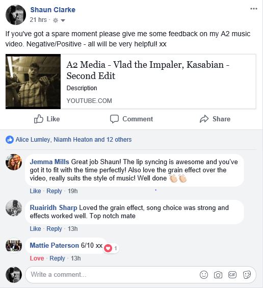
I then looked into the analytics of my video to find out how many views I was getting on my video, how long they were watching it for, and where they come from.

With this information in mind, I set about showing my new and improved video to people and filming their reactions live. I compiled the best of these reactions into a short video in the style of the fine brothers “Teens React” series. I also asked them a bit about whether they found the narrative easy to understand and whether they thought that the video suited the music…
Evaluation Point 2 – Combination of main product and ancillary texts
This week, I have analysed how effective the combination of all my media texts that I have created this year. Essential how closely I stuck to the aesthetic throughout the process.
I presented my conclusion in the following Prezzi
Evaluation Point 1 – Key Conventions
I have recently been considering my music video, and how the finished product has conformed to the conventions of my music video’s genre.
In the vlog below, I explain a lot of these conventions and how they are shown in different music videos from indie rock groups (mainly Kasabian as they wrote the song used in my music video).
I filmed the video on an iPhone 6 and after converting the file to an MP4, I used Serif Movie Plus X5 to add make sure the video was as smooth as it could be, and to add in the extra footage of the music videos.
Digipak advert, Point 7 – Final Advert
To get to this final state of my advert, I have not done much but have adjusted the ‘shadow’ on ben, blurring it more so it looks more natural and filling it out slightly.

Digipak Advert, Point 5/6 – First draft of promo advert and feedback
Here is the promotional poster for my digipak, I have followed my flat plan exactly with the addition of the photo of my star image….

I have done to the photo of Ben on the promo poster as I did to the photo in the digipak itself, meaning that people will easily be able to spot the digipak in stores etc. even if they haven’t particularly paid attention to the text.
Here is some feedback I got about my advert…


I would say that the most useful feedback from this group of comments is the second comment, and I will work on blurring the ‘shadow’ into the jumper and shirt before posting my final version.
Digipak Advert, Part 4 – Flat Plan
Below is a flat plan of the advert for my digipak. It contains everything that I will put on the poster apart from the photo of my star image. I have labelled the different aspects of the poster and why I included them.

I’m quite satisfied with this draft version, as I believe it achieves what I set out to achieve with this advert. Which was simplicity, information and a very tidy/slick finish.
Digipak Advert, Point 3 – Print Advertising Research
In creating this promotional poster for my digipak, it is important to be aware of how relevant printed posters actually are, in what some might call a ‘digi-modern’ era. With so many people scrolling through social media and all the adverts that come with it, to people actually pay attention to printed adverts on billboards, or in newspapers? I have done some research into this topic to find out whether digital advertising or printed advertising has dominance.
On TheAtlantic.com, I found this somewhat outdated graph on the advertising of newspapers and their success…

Although this graph only goes up to 2012, it is clear that since the introduction of advances in digital technologies, there has been a rapid decrease in the success of printed advertising.
This graph does seem somewhat conclusive, but this is only from one source and is not completely relevant anymore. In doing some more research, I found some different opinions on the pros and cons of both digital and printed marketing. The first is a comparison chart from a marketing consultant’s post on linkedin…
Online Media Advertising
Average Cost (Yearly): $1,575,000 – $2,000,000
Monitoring & Controlling: Easy
Measurement: Measurable
Reach to Target Audience: 80% – 95% Achievable
Lead close rate: 14.60%
Print Media Advertising
Average Cost (Yearly): $2,200,000 – $5,500,000
Monitoring & Controlling: Difficult
Measurement: Unmeasurable
Reach to Target Audience: Unmeasurable
Lead close rate: 1.70%
Once more, this comparison chart agrees with the sentiments of the previous graph in that printed advertising is much more problematic to produce with little or no reward for the extra hassle.
Next, I have found an infograph on the matter…
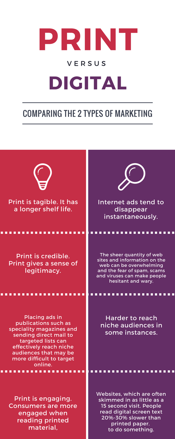
There are some very convincing arguments in this infograph for printed advertising, and a very good point is made about the sense of legitimacy that is produced with printed advertising, many people like the authenticity of printed advertising and it often seems more formal and professional. Another advantage to printed advertising is mentioned here which is the fact that you can choose to place your printed advertising wherever your target audience are most likely to be, whereas with digital advertising it is more difficult to pick out your target audience. On the other hand there are a few other advantages to digital advertising…

You can see from this advert for The Hunna’s world tour, the simplicity and interactivity on show. It is very easy to say less than a sentence on social media and then simply add a link, so that your audience can discover more information if they wish. This keeps the advert short yet engaging which appeals to the younger generations. The downfall to this simplicity is that ones adverts could get mixed in with other posts making it very hard to make your post stand out and reach its audience. The aspect of this advert which gives it an advantage over printed adverts is that this post has a video with it, this is so useful because it showcases the artist who is being advertised, showing them at their best so that fans will be more interested.
It therefore appears that the digital advert is far superior to the printed advert, despite the printed advert still holding some relevance. Nevertheless, there is somewhat of a common ground in between these to mediums, which takes the form of a QR code.
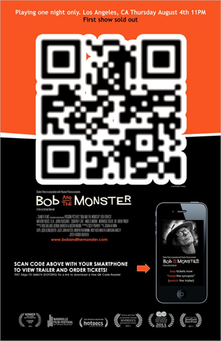
This can be very useful as almost everyone carries a smart phone and whether they are on the go and don’t have time to stop and read the poster, or whether they just want to look at more information about the music on the internet, this is a great way to help them to do so. Therefore, I think that when I produce my promotional poster to go along with my digipak, I will add a QR code to it, in order to make it as accessible as possible.
Digipak Advert, Point 2 – Recreating an existing advert
For this point I recreated an existing digipak advert from my genre to learn about the skills and aesthetic needed to create an effective digipak advert for my genre.
The digipak advert that I chose to recreate was the advert for their last album ‘AM’ which came out in 2013.
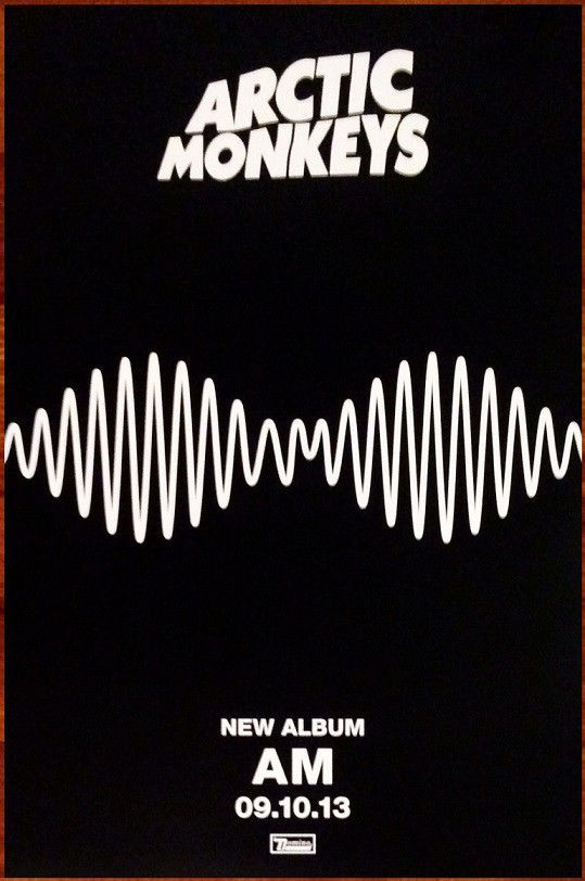
Although being quite a simple advert, there are some aspects of it which took me quite a while to try and copy.
I started with a black background…
I then took the wavy pattern from the album cover of the digipak itself and added it on top of the black background…
The next, and probably most challenging part of this exercise was adding the title ‘Arctic Monkeys’ to the top of the advert, as the text is slightly warped. I must have fiddled around with the text warping tool for a good half an hour before getting the below result which is the closest I could get.

Furthermore, I added in the additional information that is on the poster

And to finish the poster off I added the small watermark at the bottom, here are the original poster and my own, side by side.
I haven’t done a particularly bad job of this challenge, although some things I would adjust would be to centre and enlarge the text and slightly adjust some proportions and size issues with some other parts of the advert. But I think overall I have created a pretty believable promotional poster.
Digipak Advert, Point 1 – Research
Their are many different ways in which songs and albums that are being released can be advertised so that the maximum audience is reached. Today, the most popular forms of advertising are: social media, on which production companies pay social media platforms so that their adverts on people’s news feeds, and also television adverts, like th one below, which often reach out to the largest audience.
Another popular way of advertising music is through poster style advertisements that can then be posted everywhere, whether it’s in real life in record stores or at bus stops, or on social media. Below is an example of such an advert…

On the album advert you can firstly see that the colours are yet again are simply black and white, but the impact that this creates is really strong. The second thing that one notices when looking at this advert is the way that the different sizes of font attract your eye to different areas of the advert. Firstly your eyes are drawn to the word ‘KASABIAN’ which means that existing fans of the band will be immediately drawn in to looking at more of the details. The second thing your eyes will be drawn to is ‘THE DEBUT ALBUM’, this will attract hipsters and other people looking to get into new music. After this, the audience will then be drawn to looking at the singles that are included in this album, this is good for people who may have heard these songs on the radio, or somewhere else in public and enjoyed it listening to them, they might be interested in listening to more by the artist.
Another trick to creating a successful advert for an album or single is to ensure that it synergises well with the single or album itself, possibly featuring the same colour scheme or maybe even the same piece of artwork displayed on the front of the digipak. Kasabian did just this with their debut album and its advert.
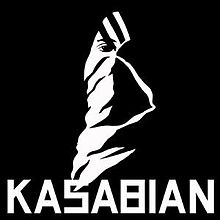 As you can see the album cover has the exact same artwork on it as the advert does, this synergises well, which is great because even if people don’t actually pay attention to the text on the advert they will subconsciously be aware of the artwork itself, and so when they see the album in shops or online they see it as being more familiar and are more willing to buy it.
We can see this same close, but simple, synergy in Kings of Leon’s fifth studio album, ‘Come Around Sundown’. You can see below that both the album advert and the album itself feature heavily saturated pictures of a sunset scene on a beach, with tropical trees in the background or foreground.
The album advert also features the same ways of drawing the eye as I mentioned with the Kasabian album, with the biggest font being the band’s name, followed by additional information for those who want it. In contrast to the Kasabian album however, the Come Around Sundown has a much more relaxed atmosphere to it, it isn’t as harsh on the eye as the hard hitting black and white and sets the tone for the music in the album.


